


Apple Menu Bar and More in CSS
Making the menu bar at the Apple site, and going a little further in the quality of design, here's how it can be done in pure CSS, with no JavaScript.

This script works with Firefox, IE, Chrome, Safari, Opera. The best rendering is achieved with Firefox and Opera, but it remains fully functional with other browsers.
Unlike Apple's code that manually sets the coordinates of each menu item, it is a generic code, so one can easily change the number of items.
Graphic element
Three color schemes are available: gray, blue and green. You can make your own set of images.
To make the background images of the bar, with The Gimp:
- Create a new image, 1 pixel wide and 38 high.
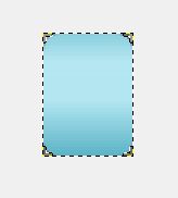
- Choose a foreground color and use the same but lighter for the background.
- Select the gradient fill tool. Enable the radial mode, and give a gap of 20.
- Reverse the direction of the gradient.
- Start at 1/4 of the height and finish below the image to 1/4 of its size.
- For the darker background when the mouse button is over the menu, use the same colors but darker and repeat the same steps.
For the rounded corners:
- Load the background image, menu-blue.gif or menu-green.gif or menu-gray.gif or your own.
- Select all and copy. Thus the image will become part of textures.
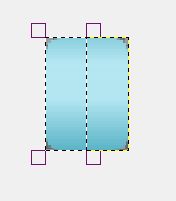
- Create a new 28 pixels wide and 38 pixels high, image.
- Perform a rectangular selection of the whole image with rounded corners.
- Fill it with a texture, the first in the list, that is the content of the clipboard filled in step 2.
Only the rounded selection is filled. - Do a rectangular selection of the left part (14x38) of the image. Think to disable the rounded corners option.
- Cut and past as a new image. Save it as menu-left.png.
- Reverse it with Image -> Transform -> Horizontal mirror. Save it now as menu-right.png.
To these graphics may be added, but it is an option, images to illustrate the topic of each menu. In our example, there are the logos of search engines.
The HTML code
It uses the principle already used for the tabbed menu: a list is transformed into a succession of elements by changing the display property, and by inserting a <a> tag in each list item you can take advantage of features recognized by all browsers on this tag ...
Here is the basic code:
<div id="menubar">
  <ul>
    <li class="firstitem"><img src="images/menu-left.png" width="14" height="38" ></li>
    <li><a href="https://www.google.com">Google</a></li>
    <li><a href="http://www.bing.com">Bing</a></li>
    <li><a href="http://www.wolframalpha.com">Wolfram Alpha</a></li>
    <li><a href="https://www.alexa.com/">Alexa</a></li>
    <li class="lastitem" ><img src="images/menu-right.png" width="14" height="38" ></li>
  </ul>
</div>
You can edit the menu by simply adding or removing items...
The CSS code
It completely redefines the display of a list within the menubar layer, and change the display of a link in the same context.
#menubar ul: Define the police and the margins.
#menubar ul li: display:inline to remove the markers and make the display horizontally rather than vertically (see the display property).
#menubar ul li a: Defines the shaded background image and aligns the text. In advanced mode it adds transparency too.
#menubar ul li a: hover: When the mouse passes over the menu, the item is darker. To do this, we define a darker background in this property.
.firstitem and .lastItem: Sets the images with rounded corners to the sides of the menu.
Adding icons
The menu at this stage corresponds to that of the Apple site, plus colors, and CSS code rather than hand-made definitions for each item.
But we want to go further by adding icons or pictures on the menu, beside or behind the text.
We want to display these icons in the background, so allowing to change the menu items with larger images on which are superimposed texts.
To do this:
- We use the image or icon as a background for the <li> tag with a depth z-index:2.
- A <a> tag uses a gradient background and text, we gives it a depth z-index:3 which puts it in over the picture.
- And we gives to the shaded background of the <a> tag a partial transparency to show the image behind it.
The CSS of <a> tag is amended as follows:
#menubar ul li a
{
  ...
  z-index:3;
  moz-opacity:0.8;
  opacity:0.8;
  MozOpacity: 0.8;
  KhtmlOpacity: 0.8;
  filter:alpha(opacity=80);
  padding-left:32px;
}
And we add a definition for the pictures that must have each their own identifier:
<li id="google"><a href="https://www.google.com">Google</a></li>
<li id="bing"><a href="http://www.bing.com">Bing</a></li>
<li id="wolfram"><a href="http://www.wolframalpha.com">Wolfram Alpha</a></li>
<li id="alexa"><a href="https://www.alexa.com/">Alexa</a></li>
CSS code:
#google
{
  background:url(images/menu-google.gif) 5% 40% no-repeat;
  padding-top:16px;
  z-index:2;
}
And similarly for each menu item: bing, alexa, wolfram...
Demo and source code
Making a menu bar similar to that of the Apple's website, enhanced with images and colors.