


CSS Shadow
Adding a shadow under box displaying a text or an image can be done in HTML and CSS with no JavaScript or framework.
Since CSS 3 which is supported by modern browsers, you can use properties of shading.
.shadow
{
  -moz-box-shadow: 4px 4px 10px #888;
  -webkit-box-shadow: 4px 4px 10px #888;
  box-shadow:4px 4px 6px #888;
}
But for older browsers, it is necessary to use substitutes.
Embedding layers
The idea is to nest layers into one another, with a lag and a background color gradually darkened hue.
<div class="box" style="width:400px">
    <div class="offset color1" >
        <div class="offset color2">
            <div class="offset color3">
                <div class="offset inner">
                        Message
                </div>
            </div>
        </div>
    </div>
</div>
Just insert this code in the page and link the style sheet that makes the shadow (in the demo, the CSS code is inside the HTML page).
Here is the CSS code for the offset and the colors:
.offset { position: relative; left:-1px; top:-1px; }
.color1 { background: #F0F0F0; }
.color2 { background: #DBDBDB; }
.color3 { background: #B8B8B8; }
The width of the box shall be specified in the HTML code if you use different size boxes.
In the case of an image, you must also specify the image size for the layer that contains it, and a padding to 0, contrary to the text that should have a margin.
div class="offset inner" style="padding:0;height:400px;width:258px" border="0" >
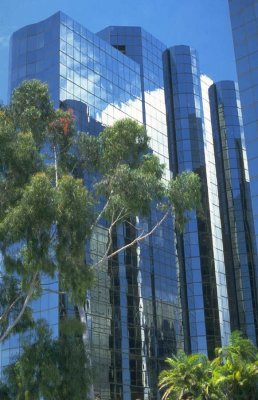
<img src="images/20.jpg" />
</div>Demonstration of a text box with a CSS shadow
Demonstration of an image box with shadow....
Using an image for the shadow
The previous method has the advantage of using only CSS code, but requires that you insert a big block of HTML code.
This can be simplified by using an image to create the shadow of the box. To do this we draw an image with a white background and a gray gradient on the right and bottom side. Here is this image.
This image is used with this CSS code:
.shaded
{
    background: url(images/shadedborder.gif) no-repeat bottom right;
}
The image becomes the background of a container that contains either another layer for a text message, or directly an img tag.
In the second case the HTML code is minimal:
<div class="shaded" style="height:410px;width:268px">
    <img src="images/20.jpg" />
</div>
In the first case, an internal container must be added again:
<div class="shaded" style="width:400px;">
<div class="inner">
...content...
</div>
</div>
The img tag and the inner layer are shifted by a few pixels to left and up against the outer container to reveal the shadow on the right and down sides.
Demonstration with a text box
Example of message box
The shadow is created by an image used as background for the container.
A 8-pixels margin is given to the inner container.
CSS code :
.shadedimg
{
  background: url(images/shadedborder.gif) no-repeat bottom right;
}

.innershade
{
  position:relative;
  bottom:5px;
  right: 5px;
  padding:8px;
  margin: 0;
  z-index:2;
  background:white;
  border: 1px solid gray;
}
Demonstration with an image
No container is required for the image, but one is required for the shadow again.
Full CSS code:
.shadedimg
{
  background: url(images/shadedborder.gif) no-repeat bottom right;
}
.shadedimg img
{
  position:relative;
  margin:0 0 0 0;
  z-index:2;
  border: 1px solid black;
  overflow:hidden;
}
See also